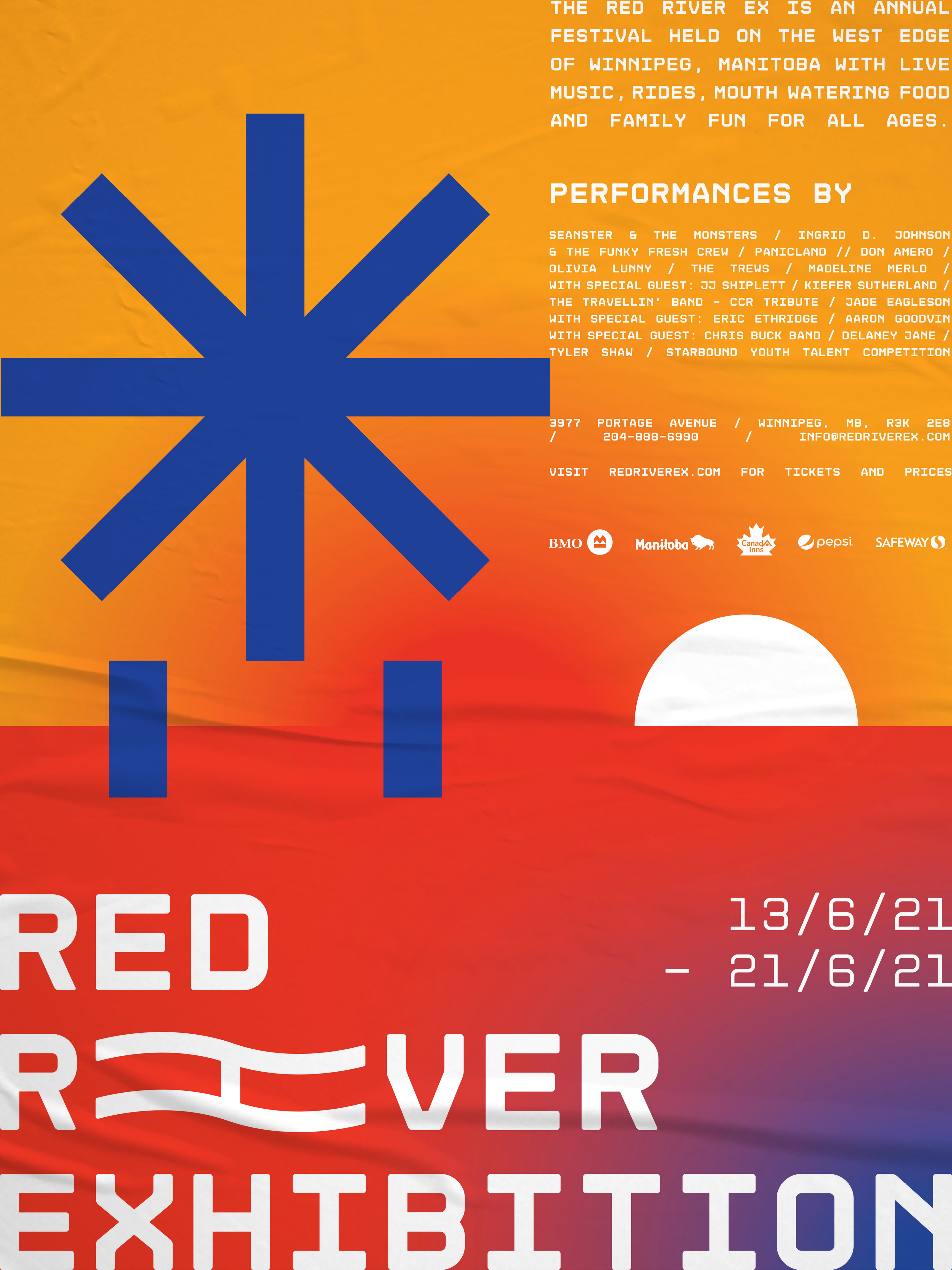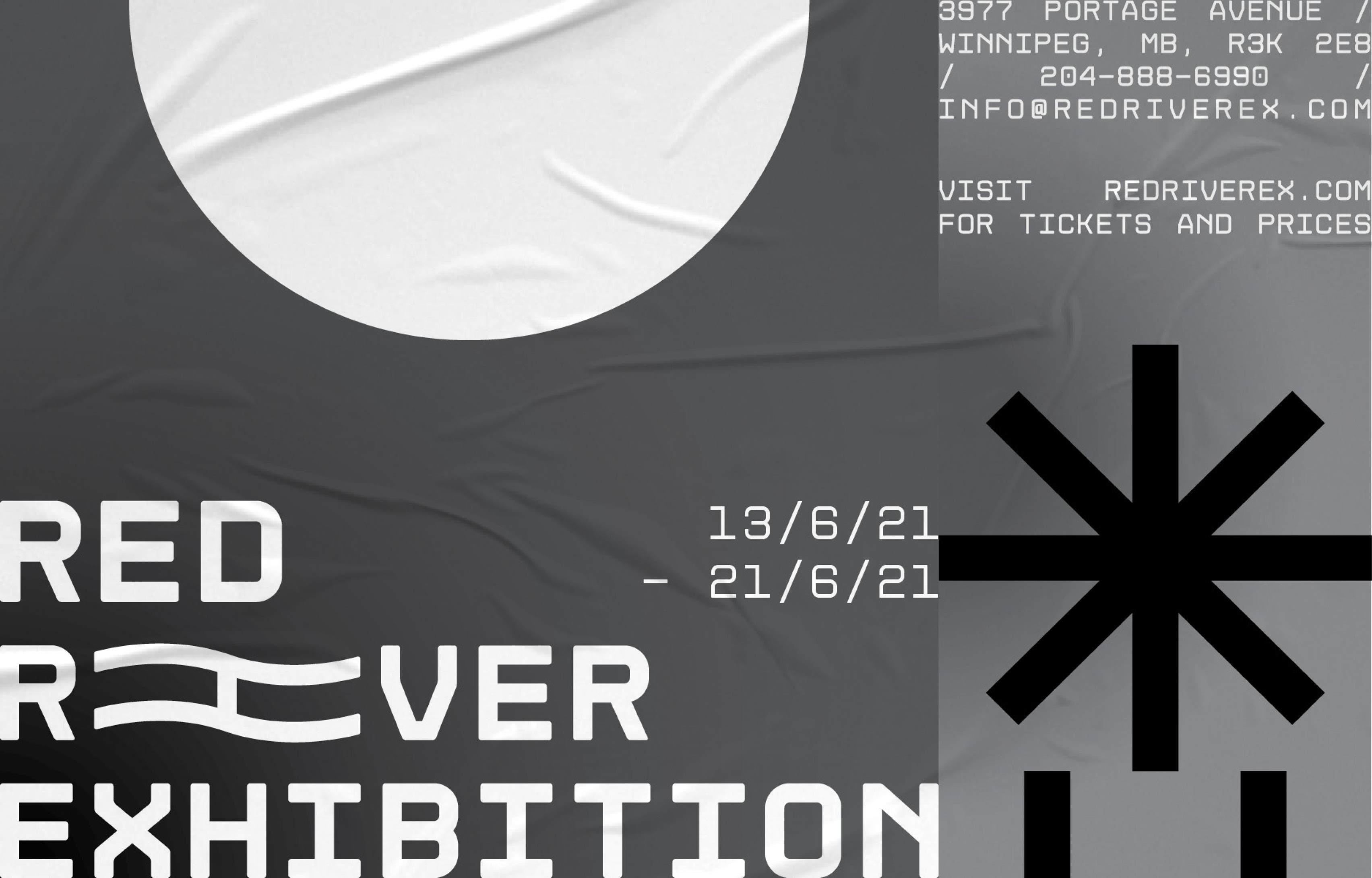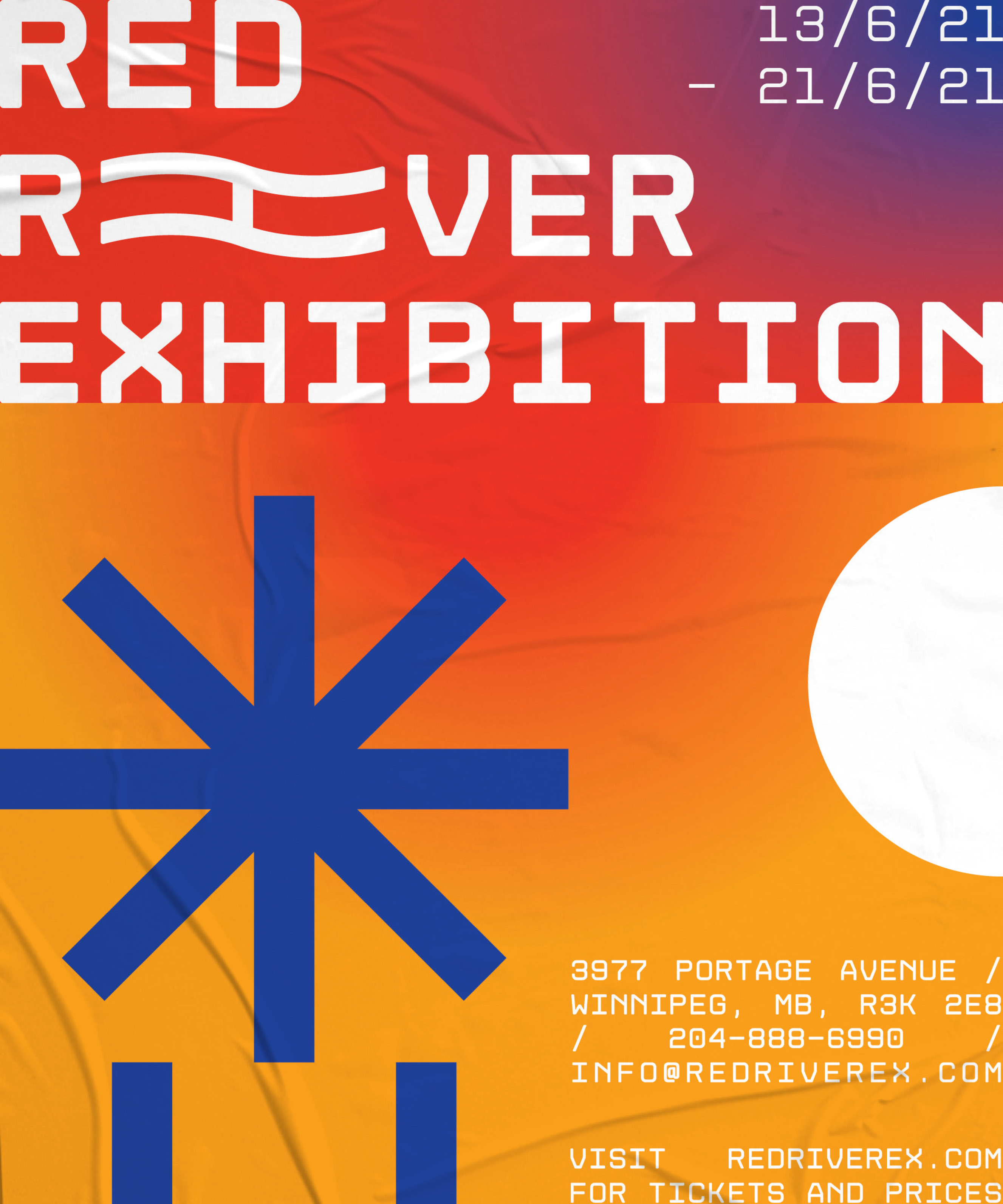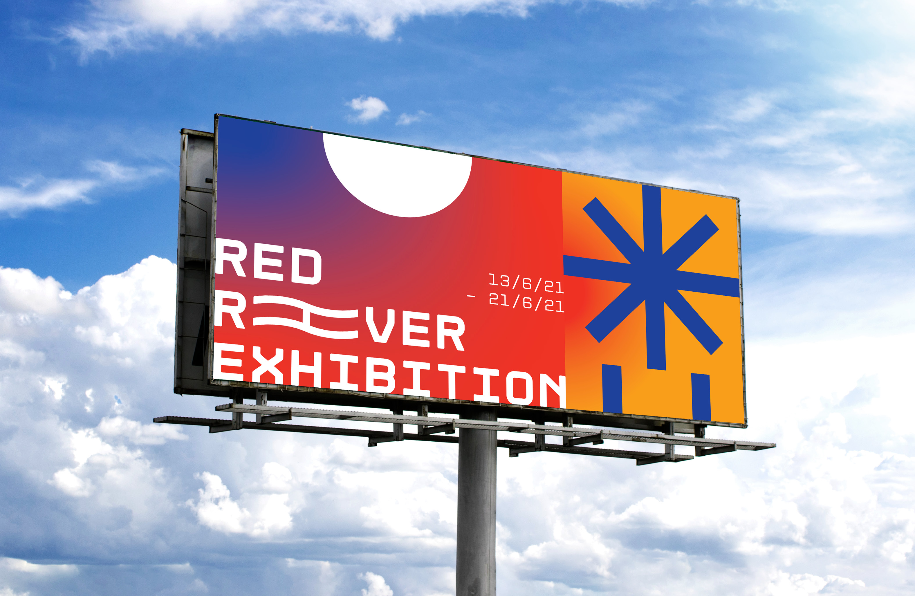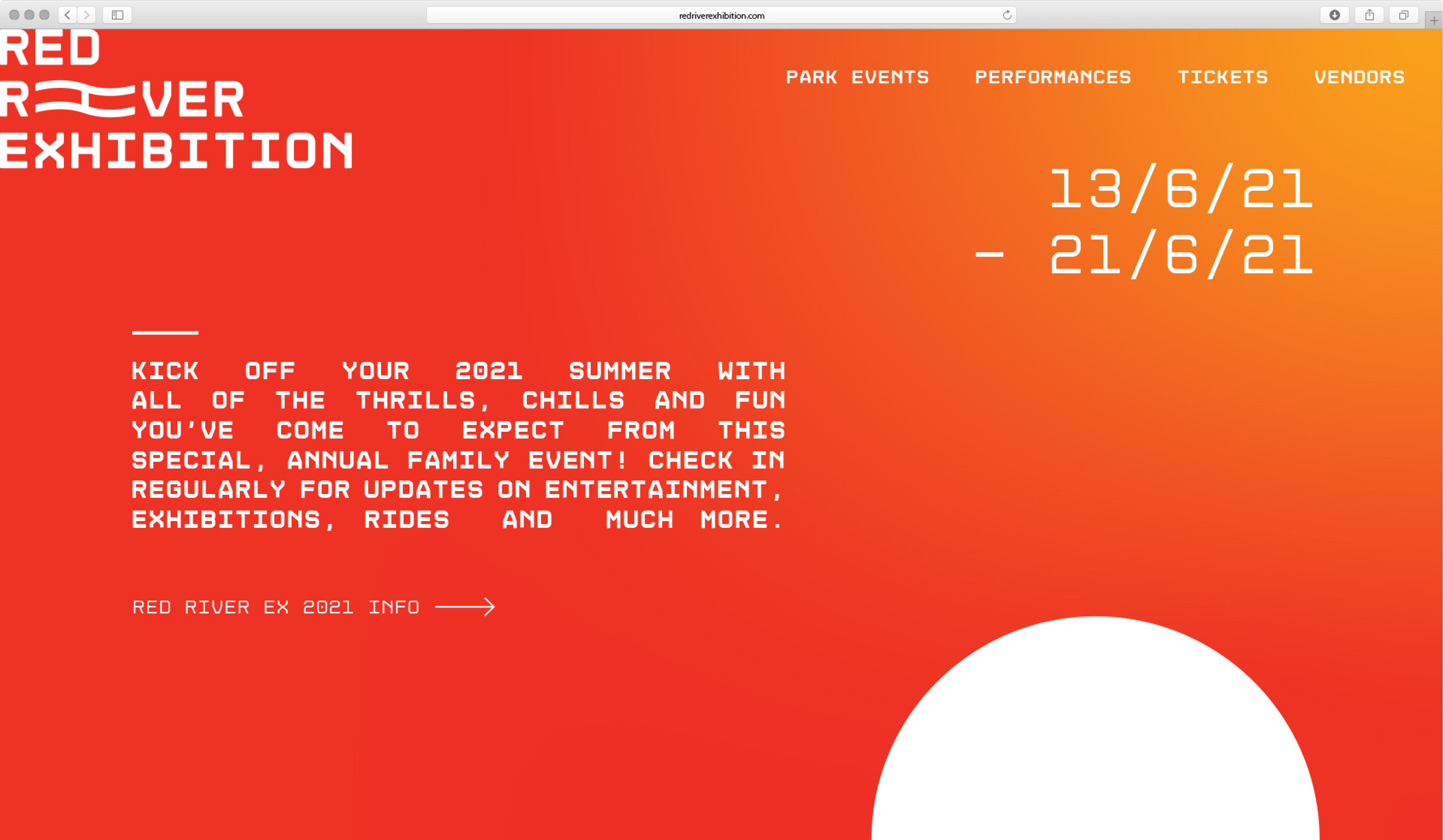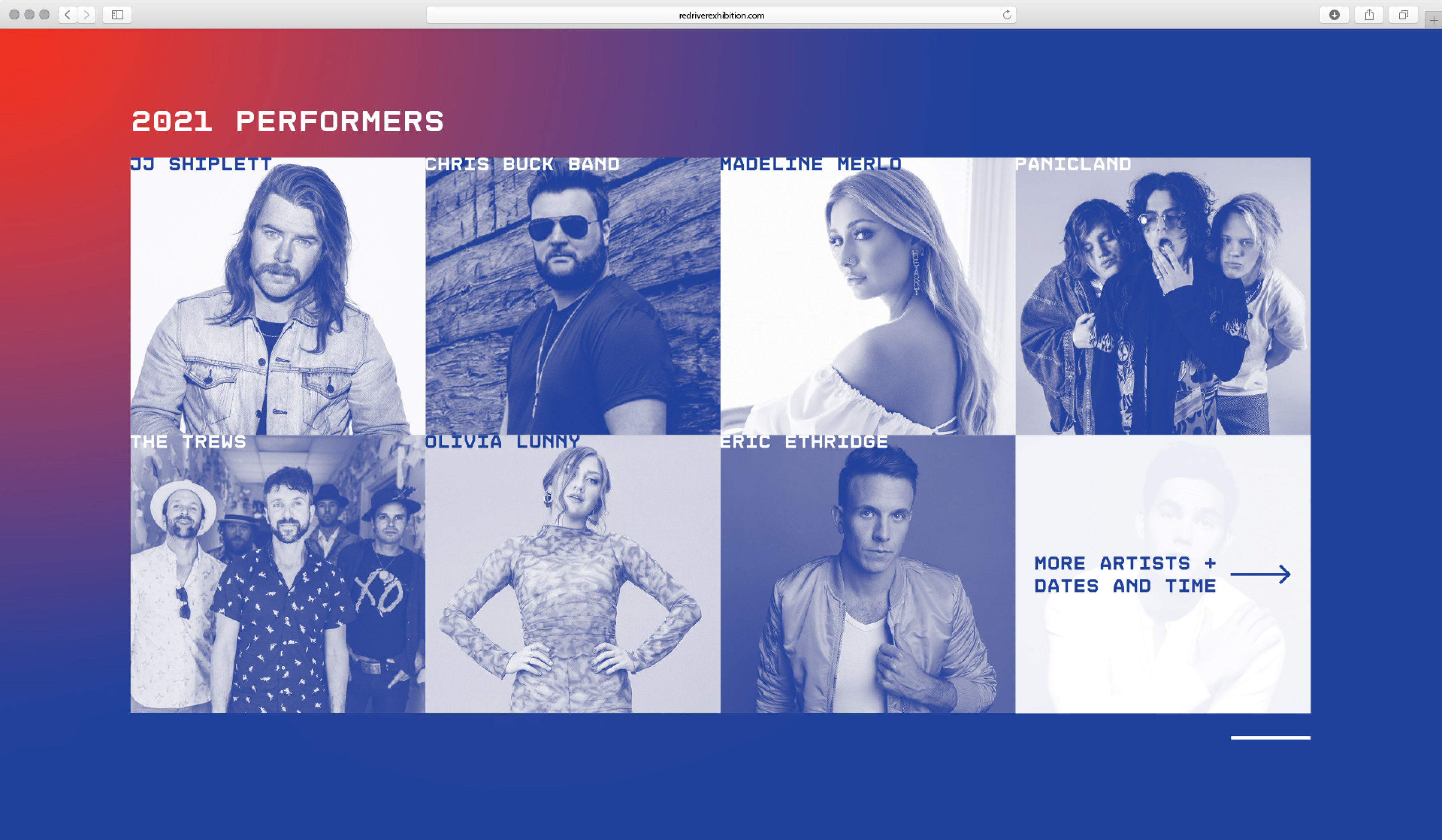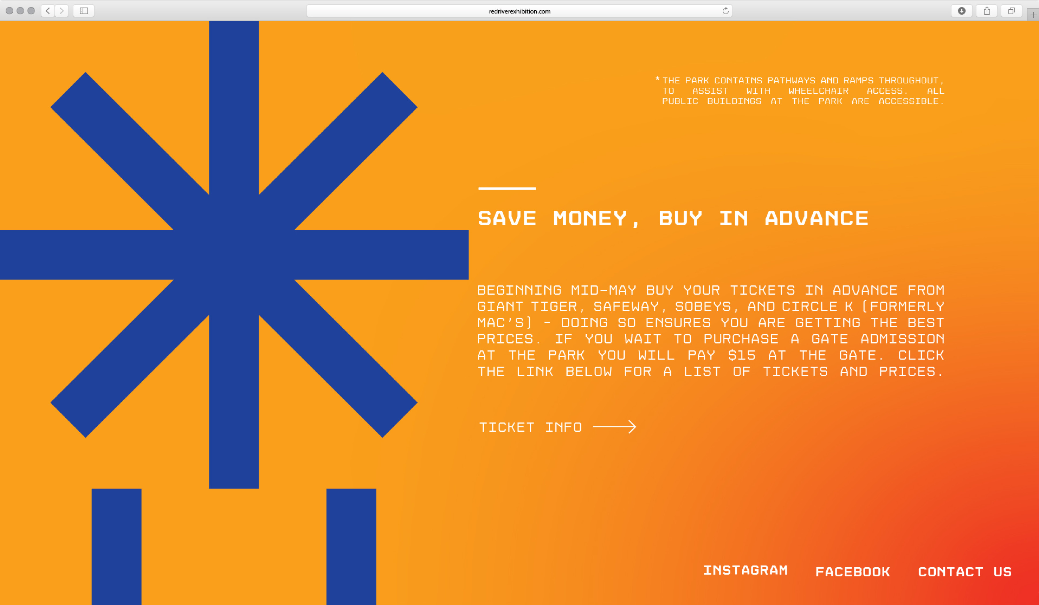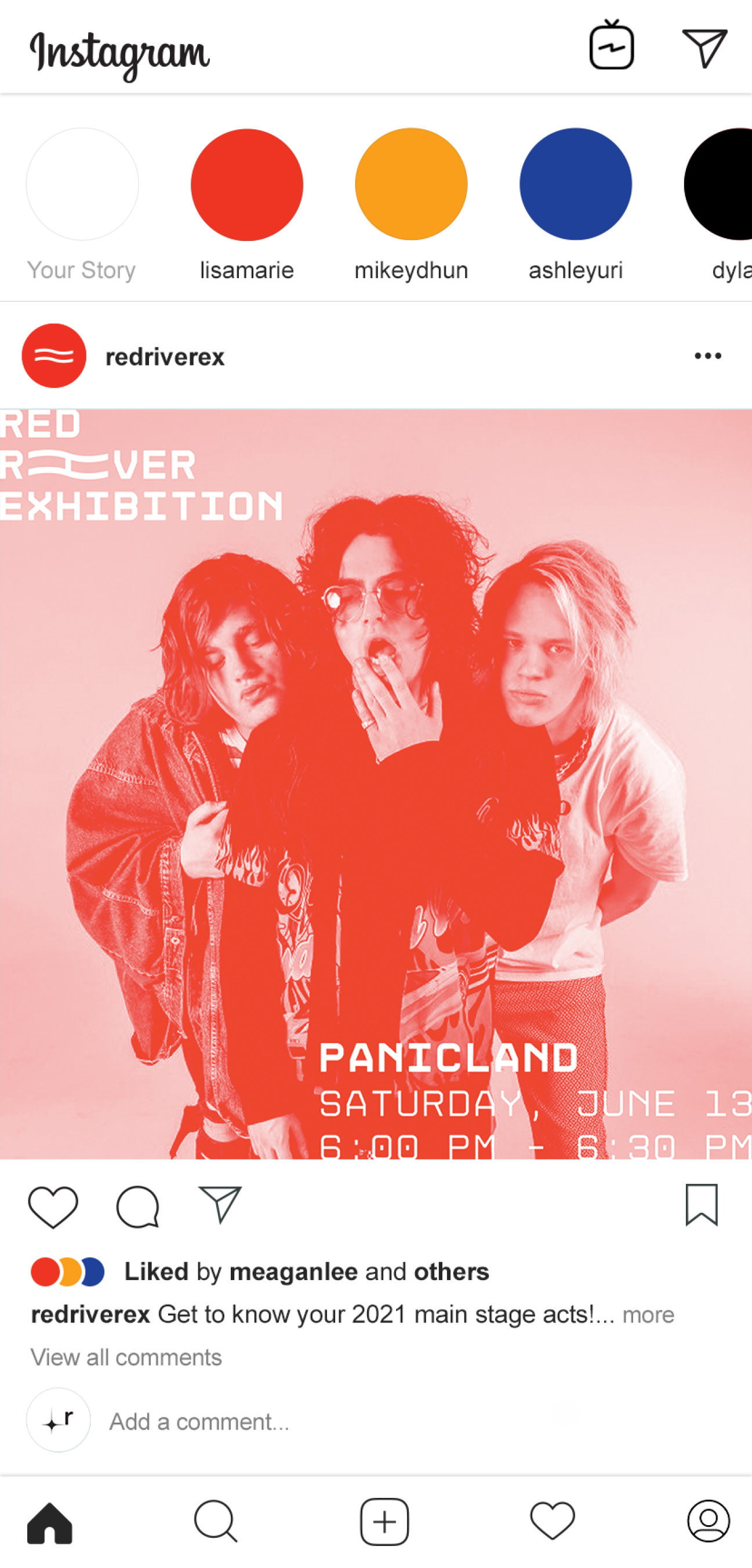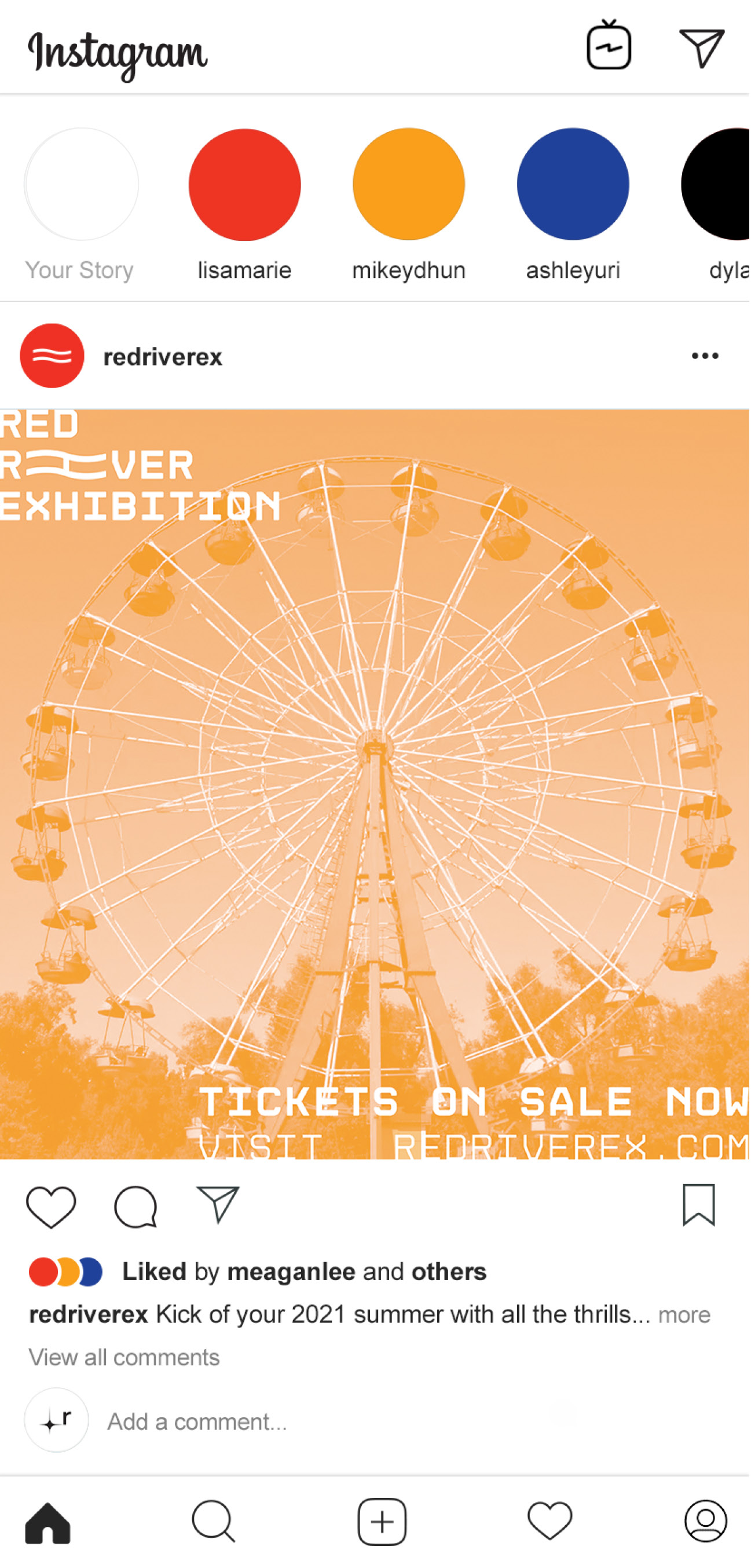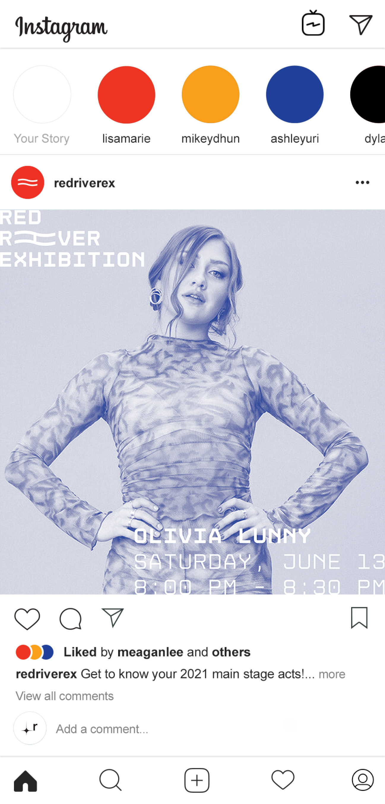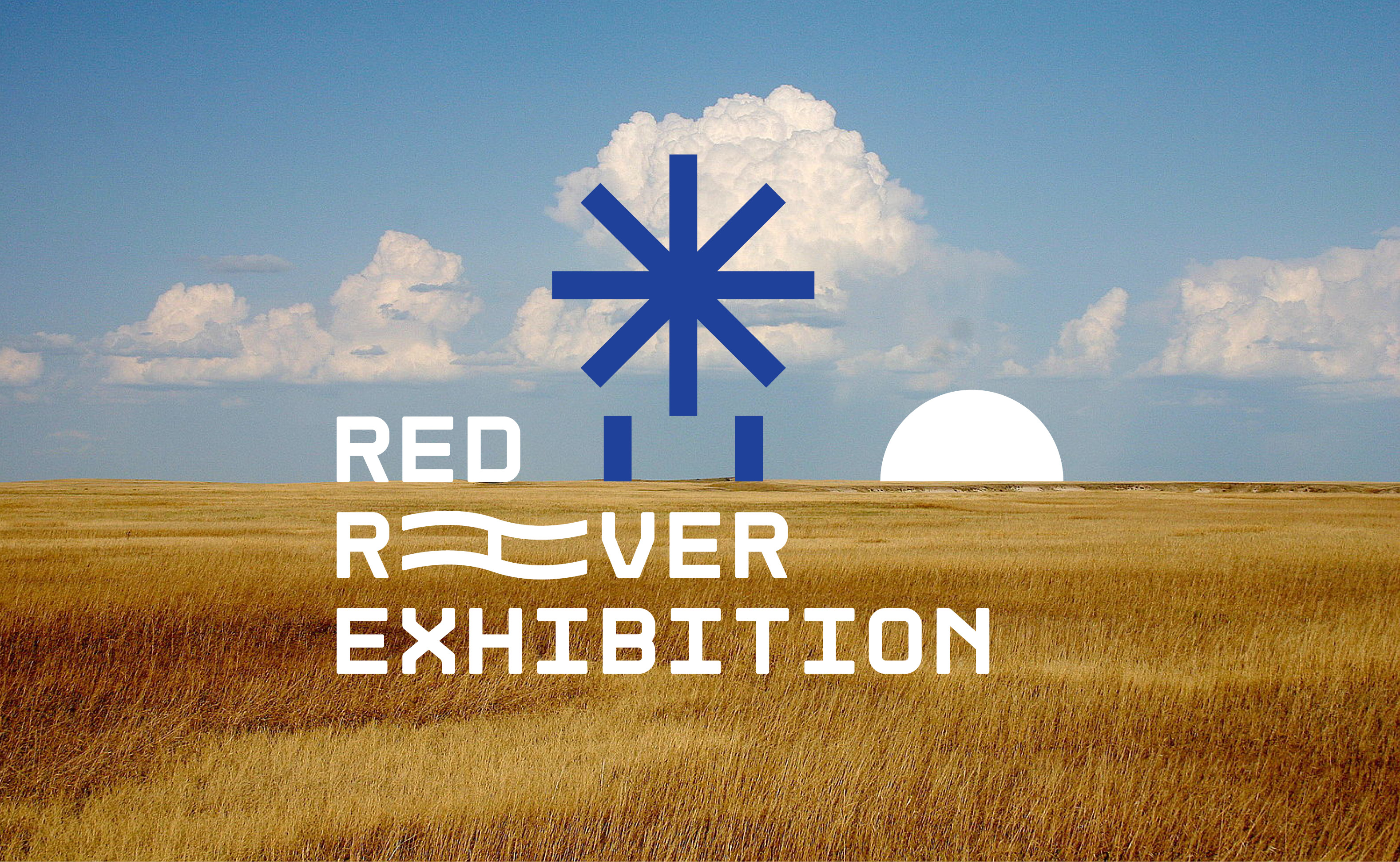
Rebrand of Red River Exhibition 2021. The goal of this rebrand was to create new artwork and theme graphics that could be implemented into the following expressions. Through use of contrasting primary colours, and graphic simplification used for the Ferris wheel and sunset — a desired sense of summer, warmth, movement and nostalgia is created. The simple yet bold theme graphics stand to create a stamp that aim to become synonymous with the exhibition and allow the option for similar graphics to be created in cohesion with the existing shapes shown. Typography takes the form in a font somewhat unconventional in hopes to create an identity that feels so incredibly different from its predecessor that the audience can’t help but partake in the Red River Exhibition.
